

Tara loves to:
Position and “tell stories” about smart initiatives, products, spaces, and people that improve design and life.
She does this with expressive:
brand voices, content messaging, tailored graphics, fashioned photography, and fully designed 3D space designs.
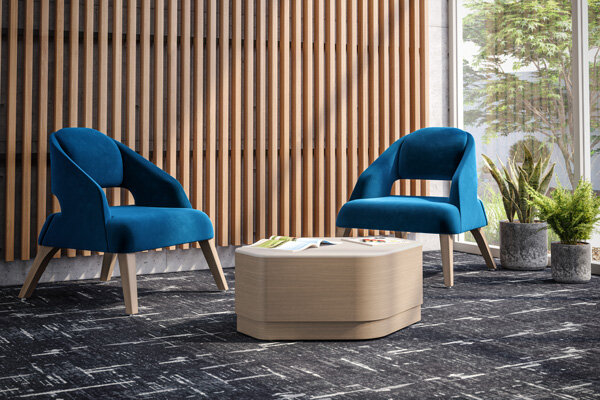
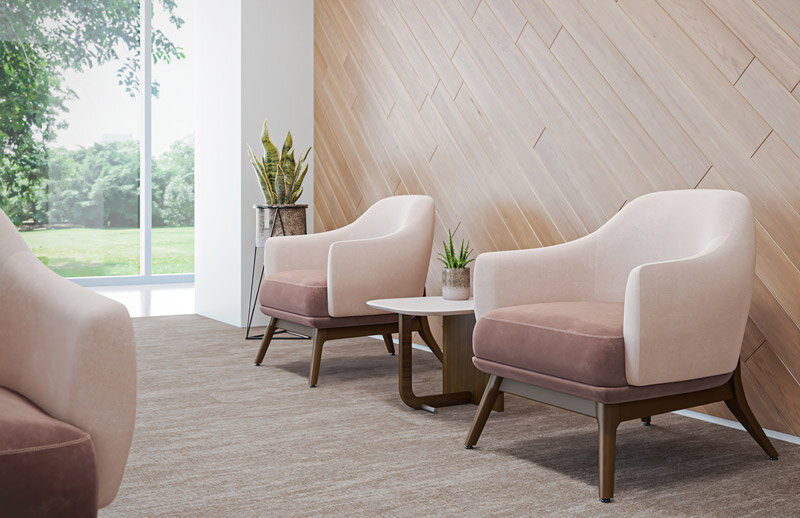
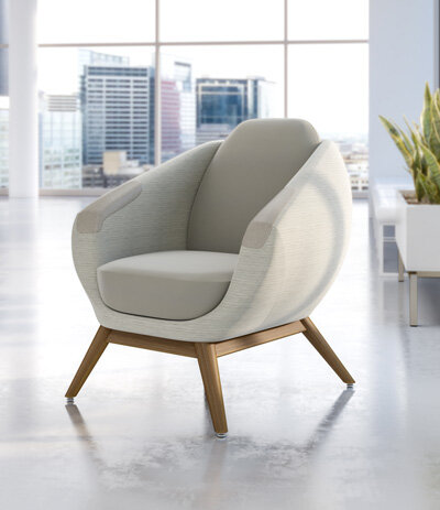
{Portfolio Sampler}
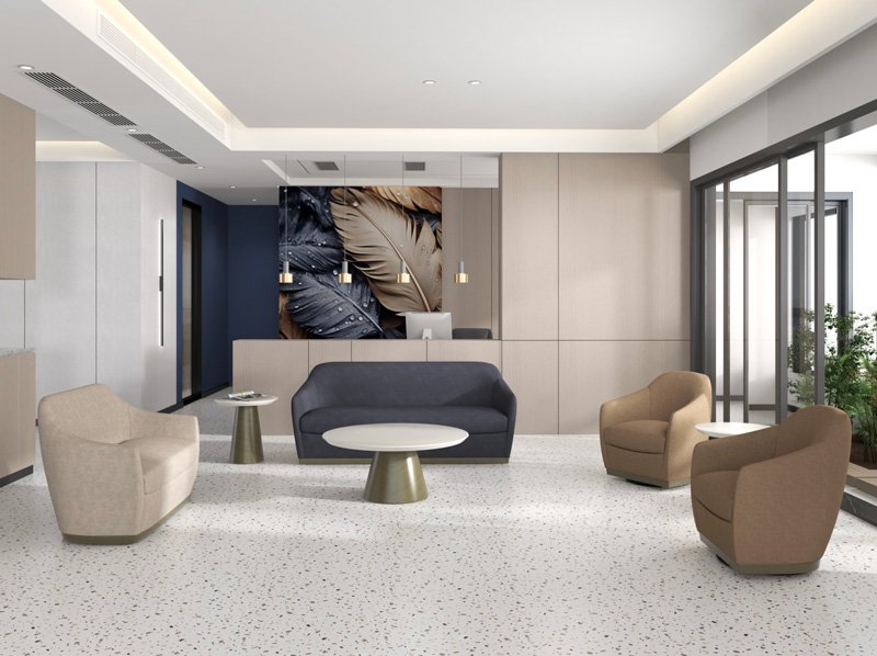
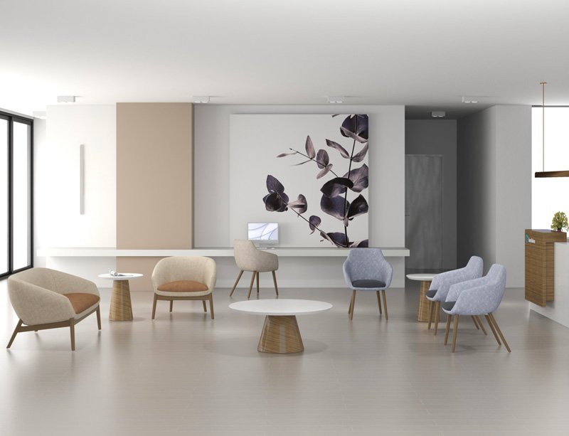
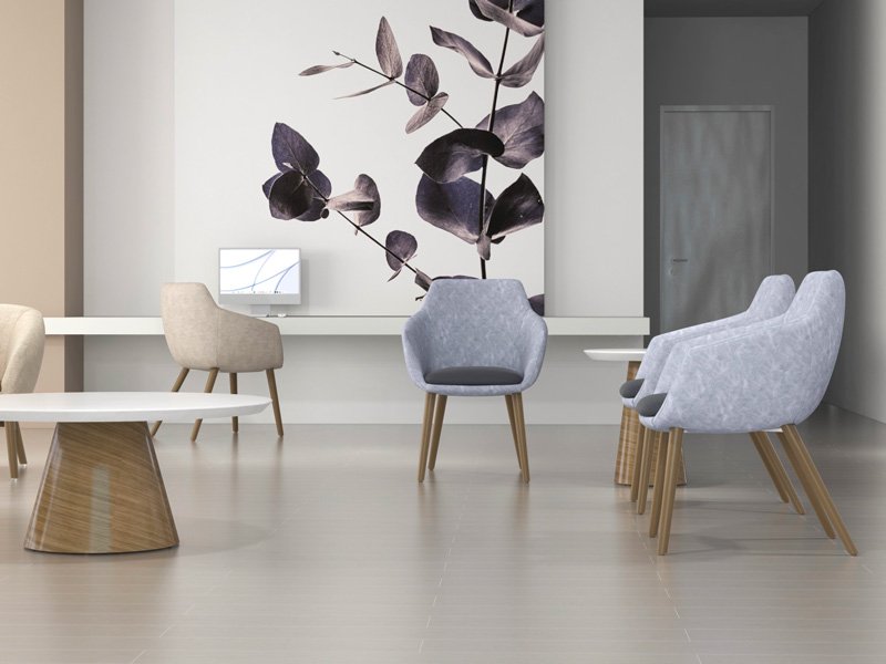
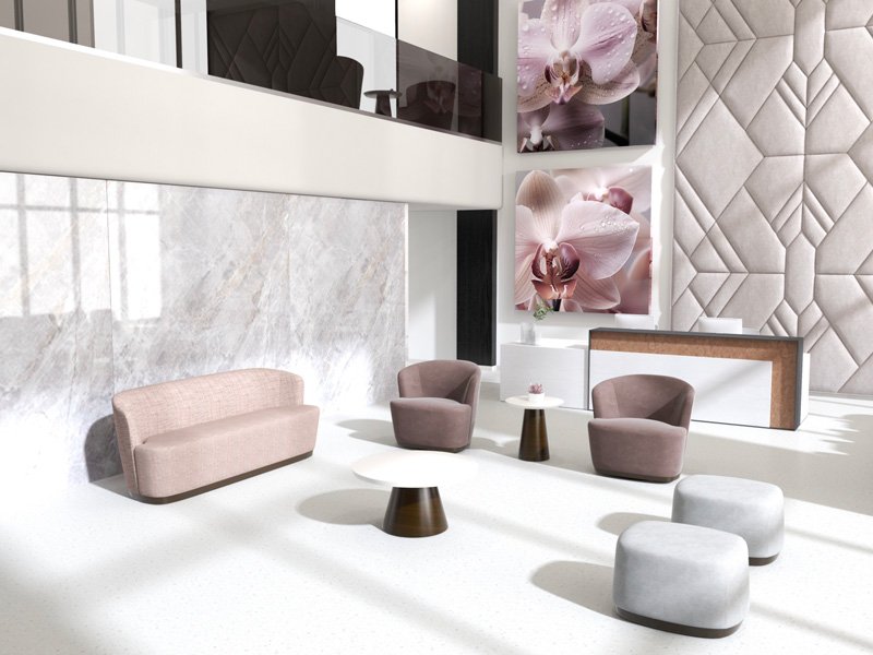
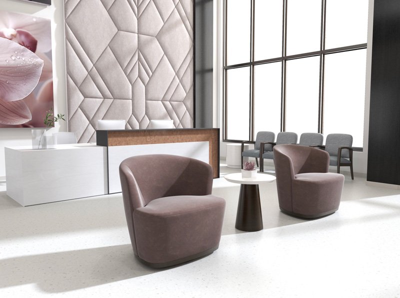
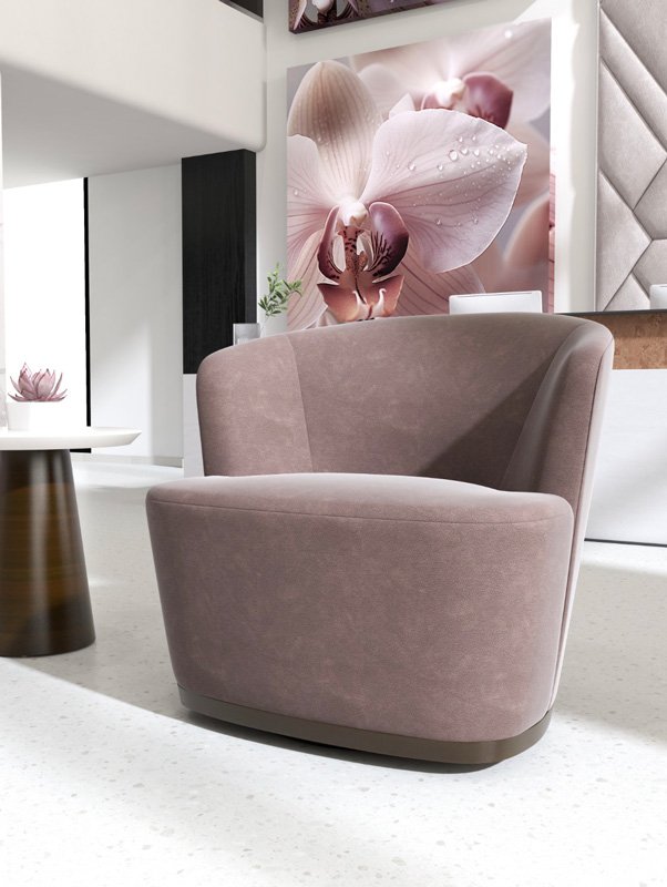
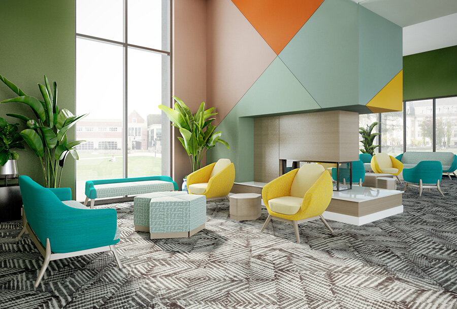
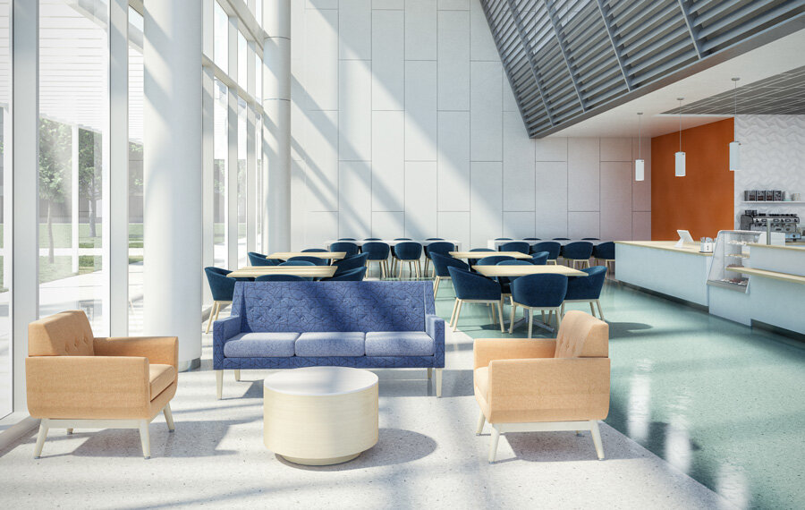
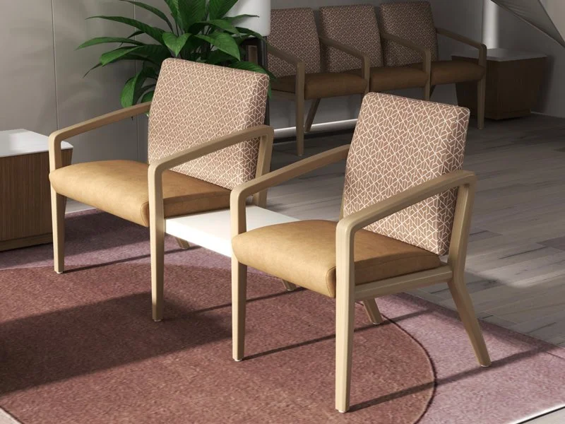
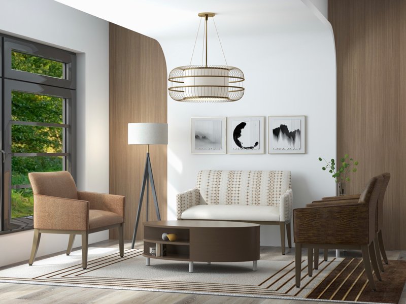
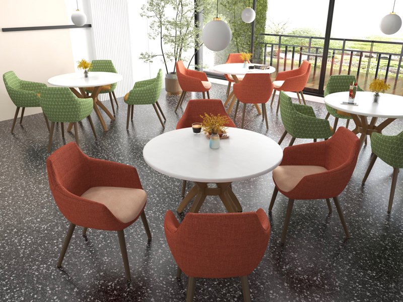
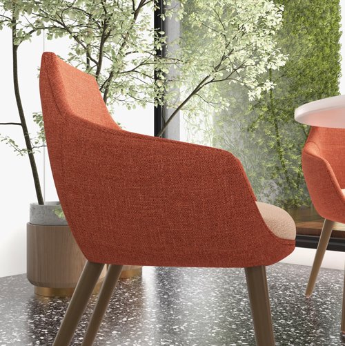
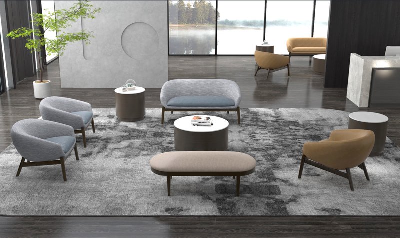
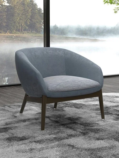
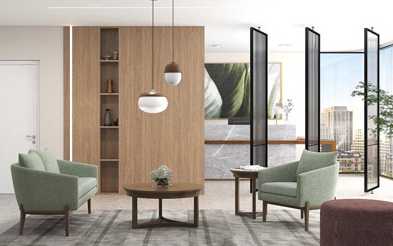
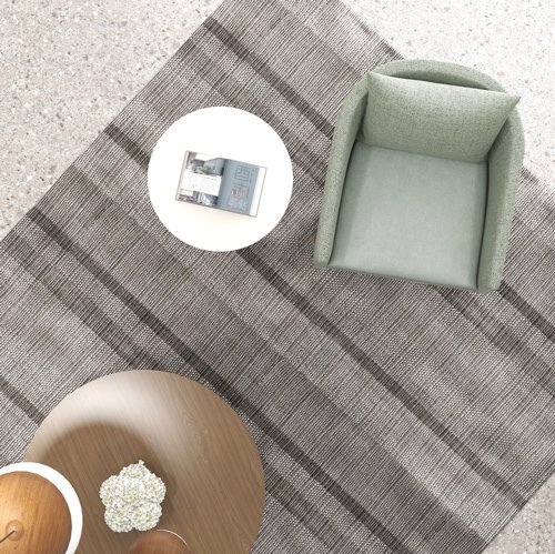
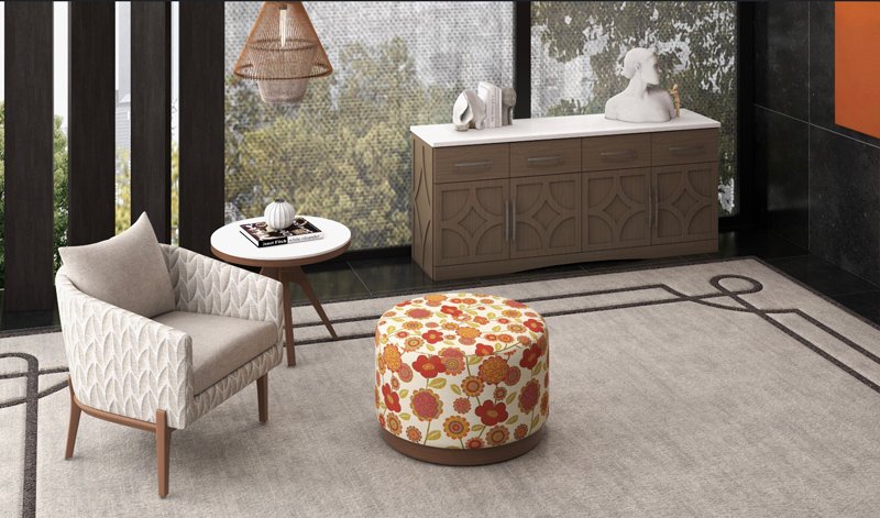
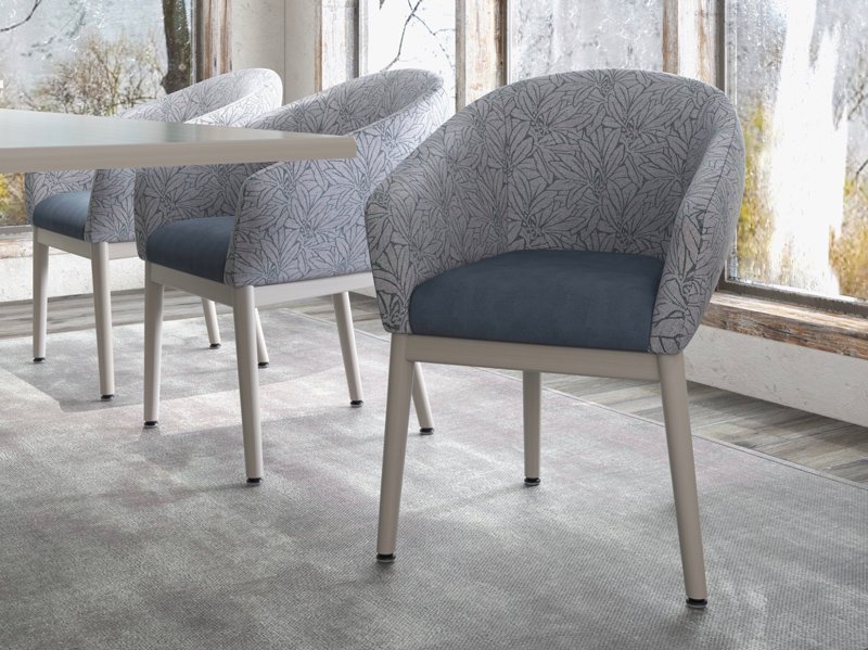
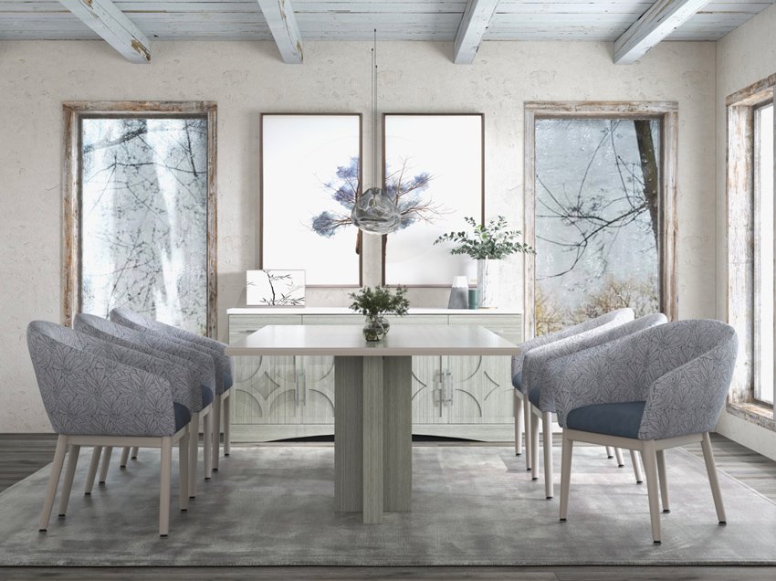
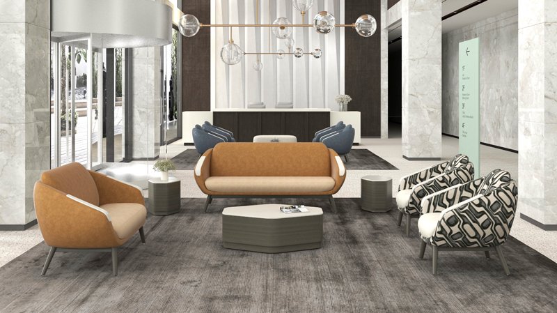
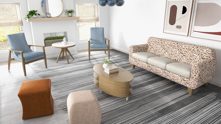
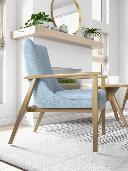
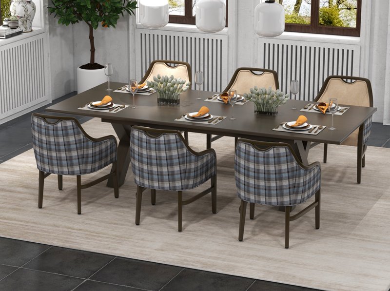
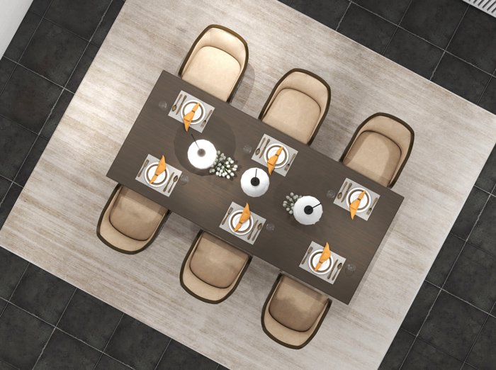
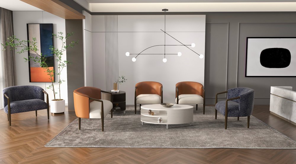
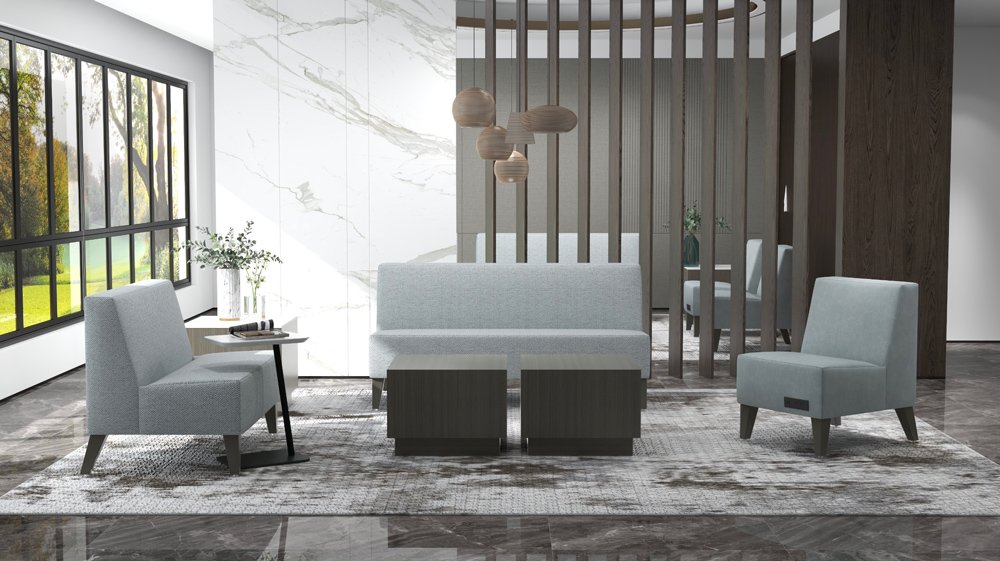
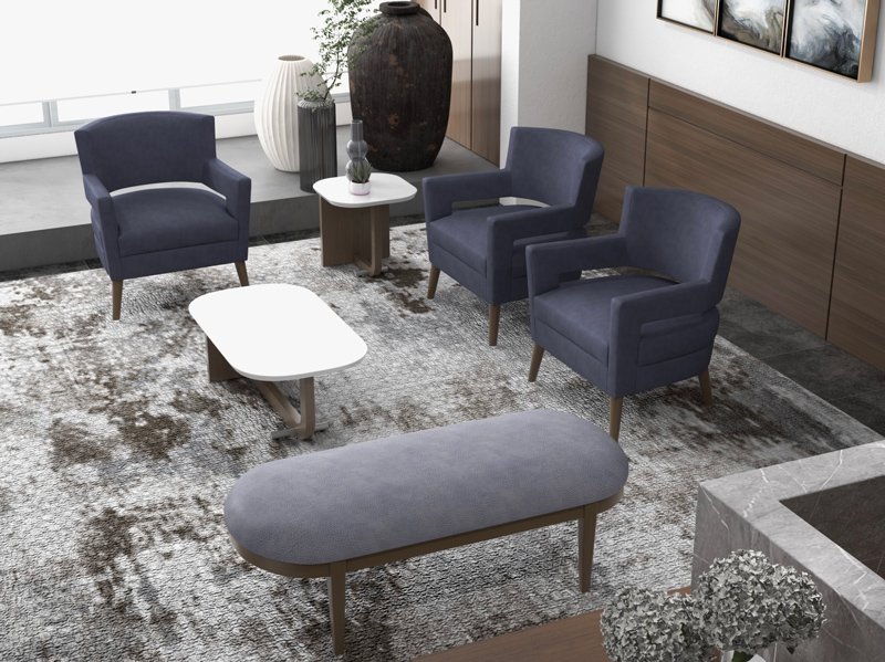
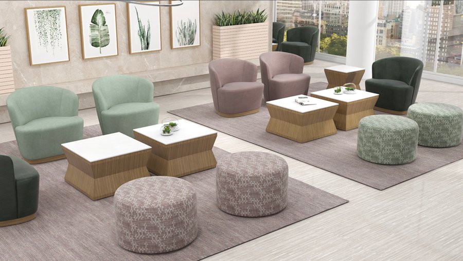
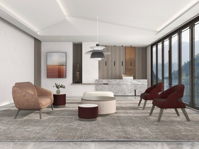
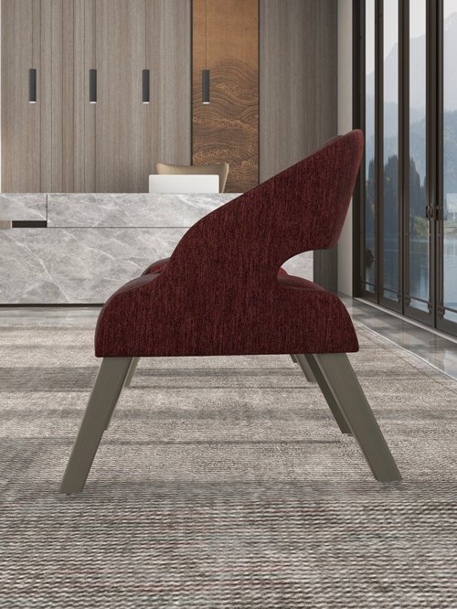
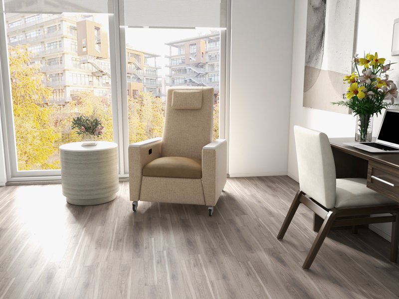
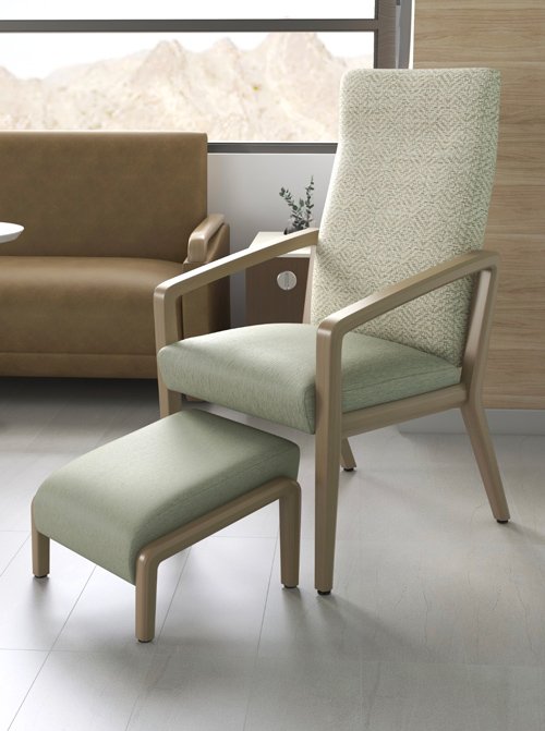
3D Generated Space Designs
A picture is worth a thousand words. To tell visual product stories, Ms. Hill LOVES to design, soup-to-nuts, 3D space designs that best showcase a product’s application. A sampling…
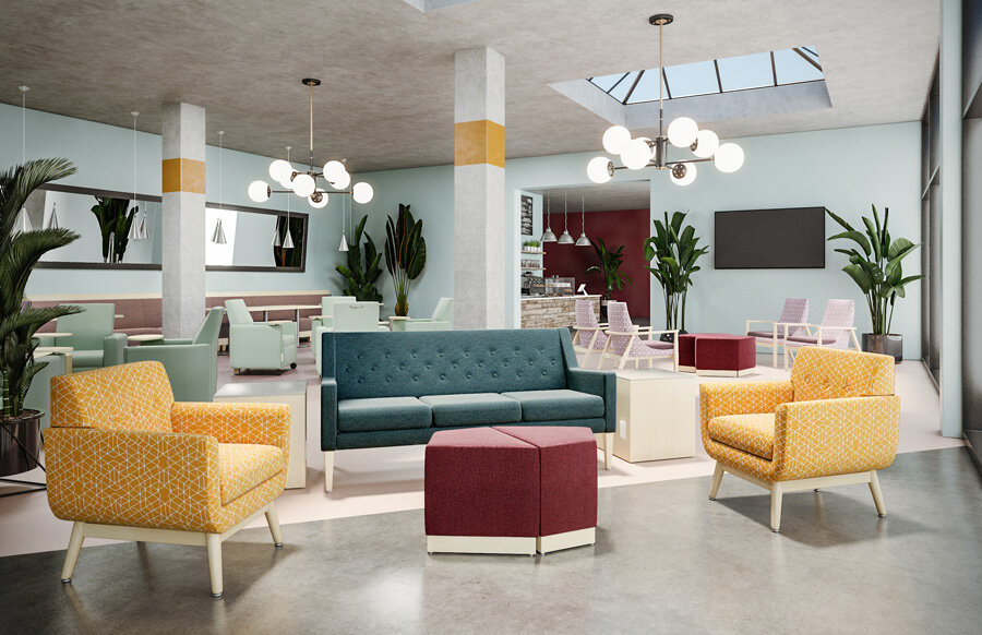
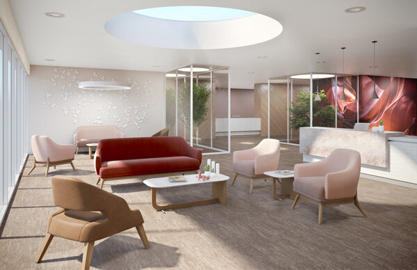
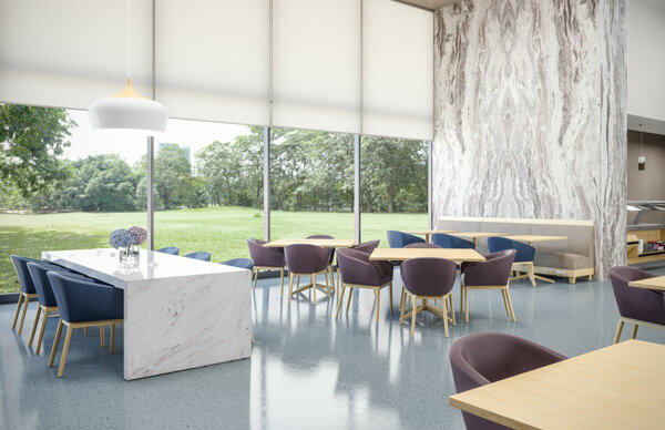
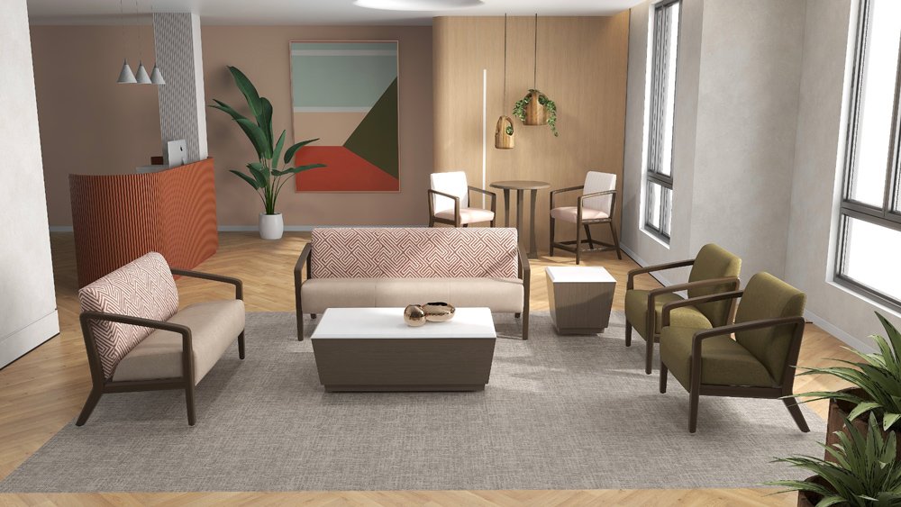
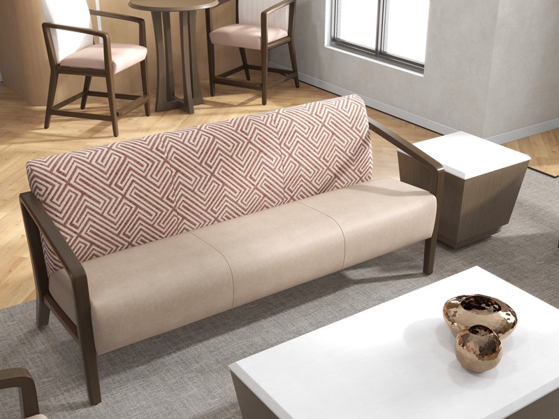
and, more…

Print + Digital Media
Tara is often asked to VOICE manufacturers' brands and/or narrate their products through alluring graphics and creative story-telling for print media, digital collaterals, and press releases.
Mannington, Magazine Ads
Metropolis + Contract Design Magazine ad. Tara styled, provided copy, coordinated photography, and lead graphics.

Photography styling and coordinations.
Mannington, Attitude Brochure


A national attitude brochure. Ms. Hill designed and executed graphics, imagery, styling, content messaging, and coordinated photography.

Metropolis + Contract Design Magazine ad to announce Mannington's launch of their Cartography Collection. Tara designed tone, styling, content messaging, and coordinated full photography.
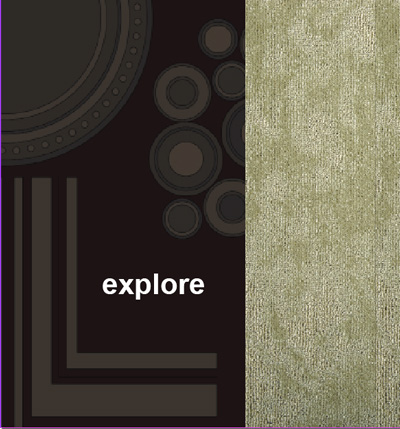
J+J Flooring + Kinetex, Informational Brochure


Ms. Hill created a 20 page print brochure for J+J Flooring + Kinetex. She lead all creative from layout, messaging, room scenes, and palette.
IOA Furniture, Magazine Ad (Cover + Inside Full Page)
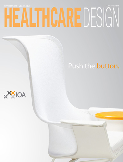
HealthcareDesign Magazine's cover and inside ad announcing IOA's 4 Booth "passport journey" at Healthcare Design Expo.
Tara lead the design of IOA's 2011 Sponsorship HCD Expo platform.
She developed show concept, 2D + 3D modular "cube design," brand voice, palette, exhibit, graphics, and all content messaging.
A 3D cube "giveaway + playful dice" for Healthcare Design's attendees, with a "IOA passport" to explore show stops, receive stamps, and win a trip.
IOA, Company Logo
IOA Furniture's new company A+D forward logo. Ms. Hill designed to modernize IOA's brand.
IOA Furniture, Trip “Passport + Giveaway” w/ Playful Dice

Print ready artwork for IOA’s “Passport Journey” to win an Italian Trip.

Cover of Promotional Brochure for HCD11 Expo
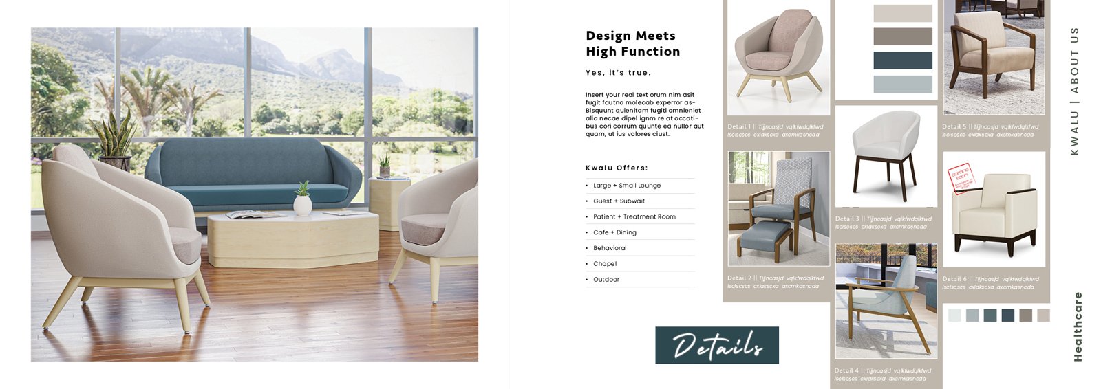
Kwalu, Product Attitude Brochure
Full story of Emarese Collection + Kwalu Attributes
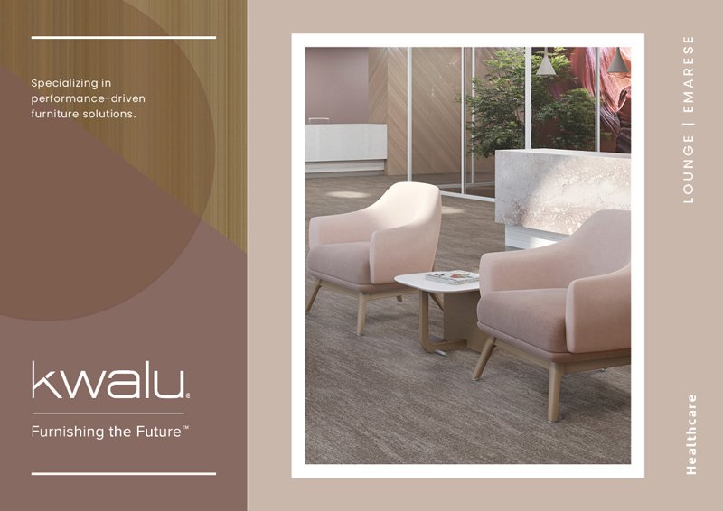
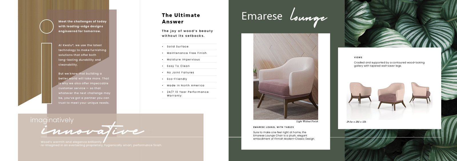
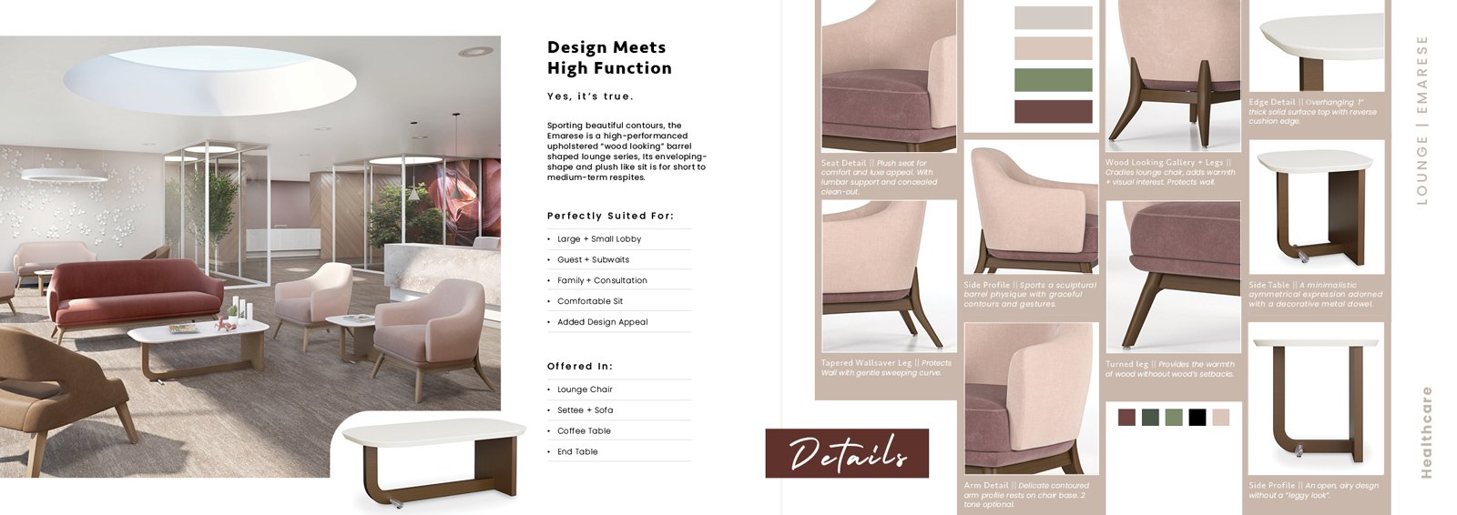
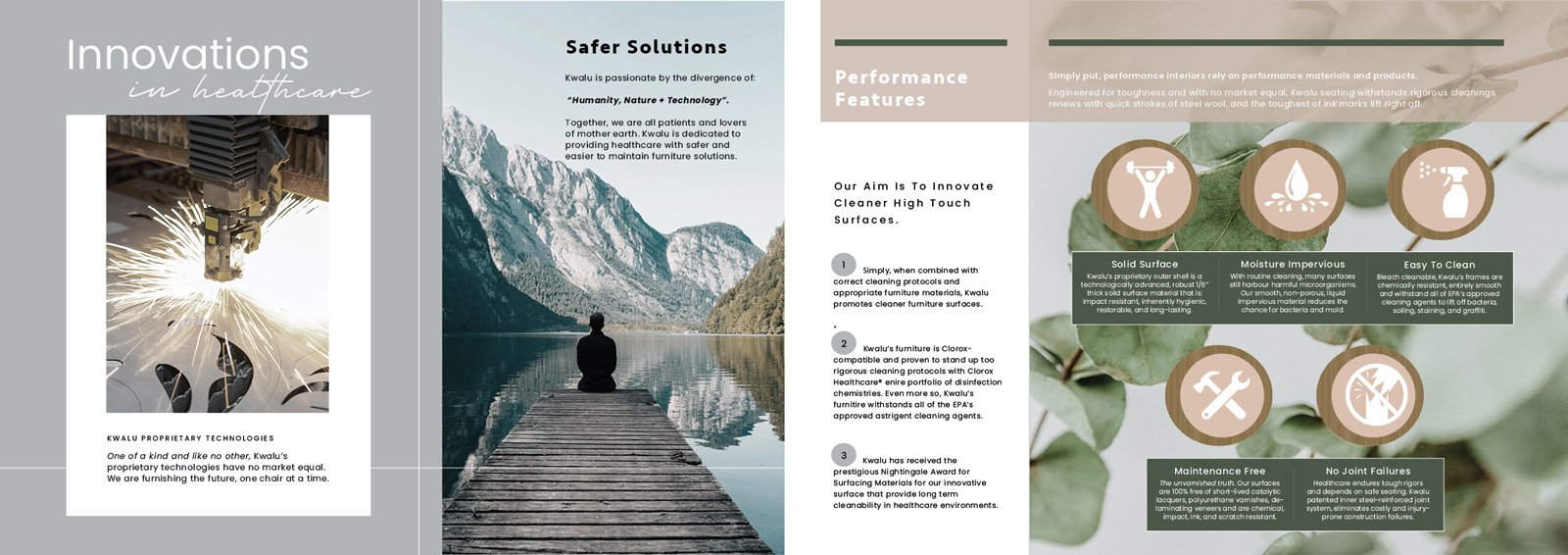
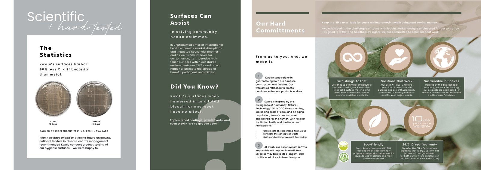
Kwalu moves towards style-forward designs. A 12-page Attitude Brochure. Tara designed graphics and authored all promotional language.
Brochure is designed as a “working chassis.” It’s easily altered for all Kwalu product initiatives (to save on time/expenses) and to insure a continuity of brand appeal.
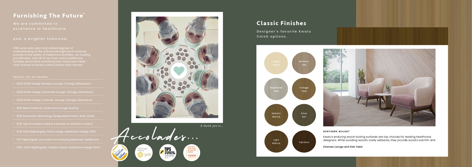
Kwalu, “About Us” Brochure
Featuring the Essence of Kwalu + Discerning Attributes
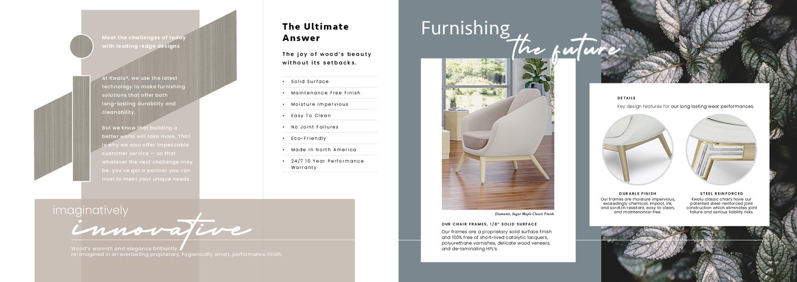
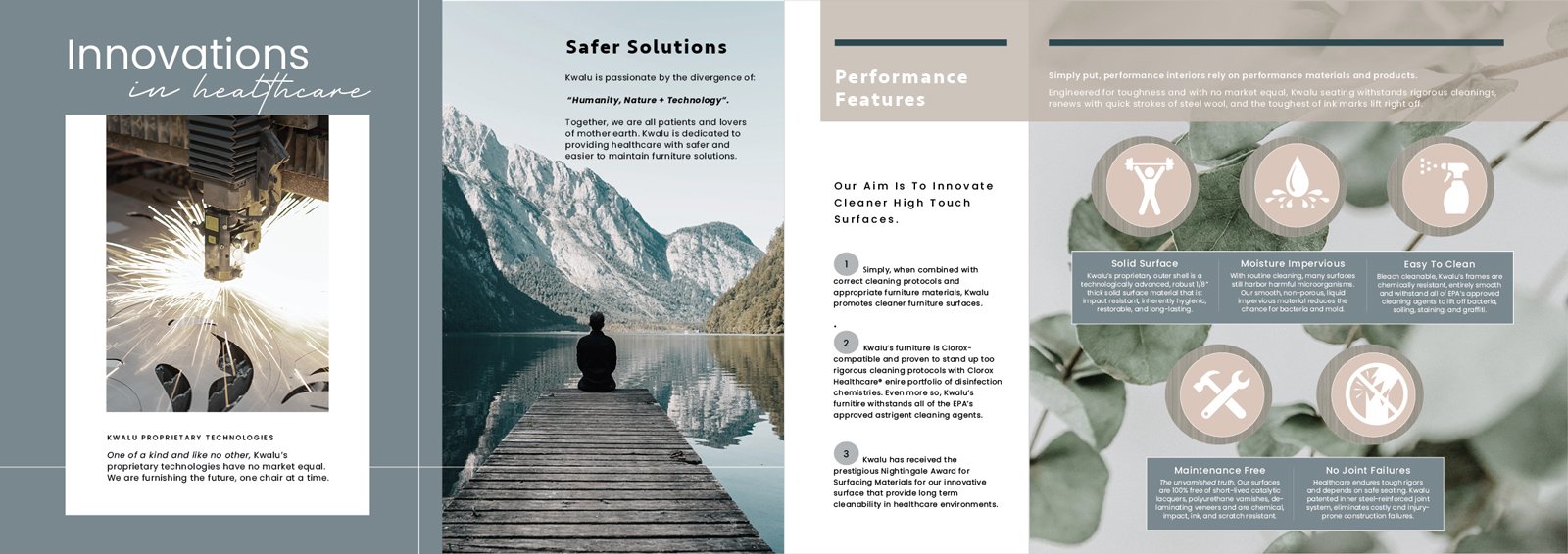
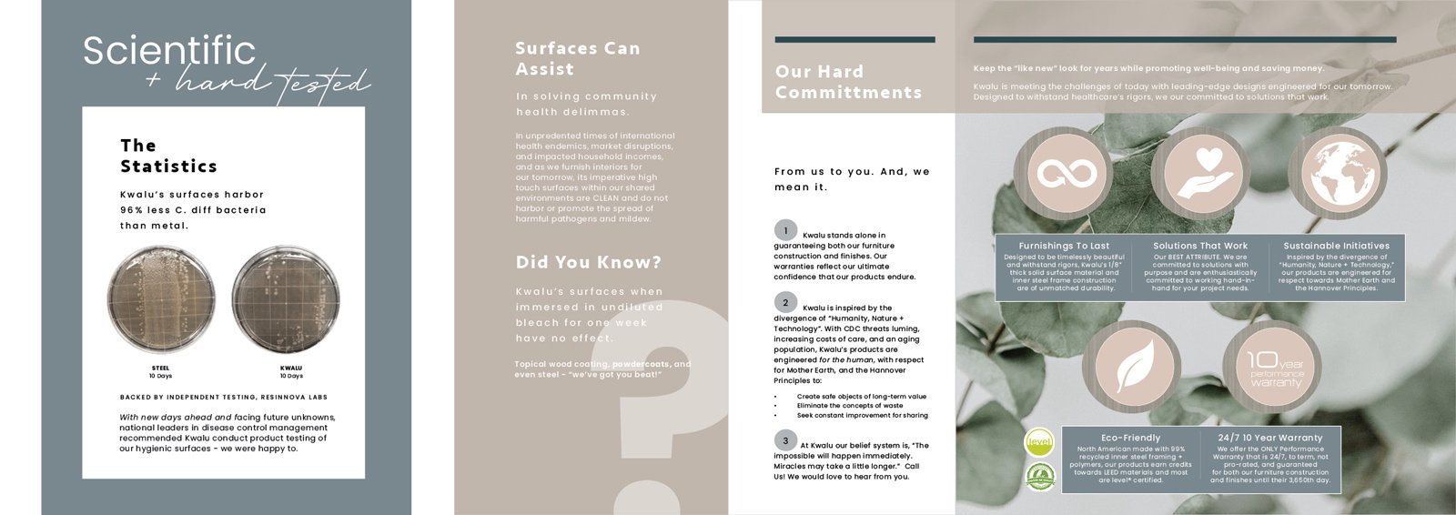
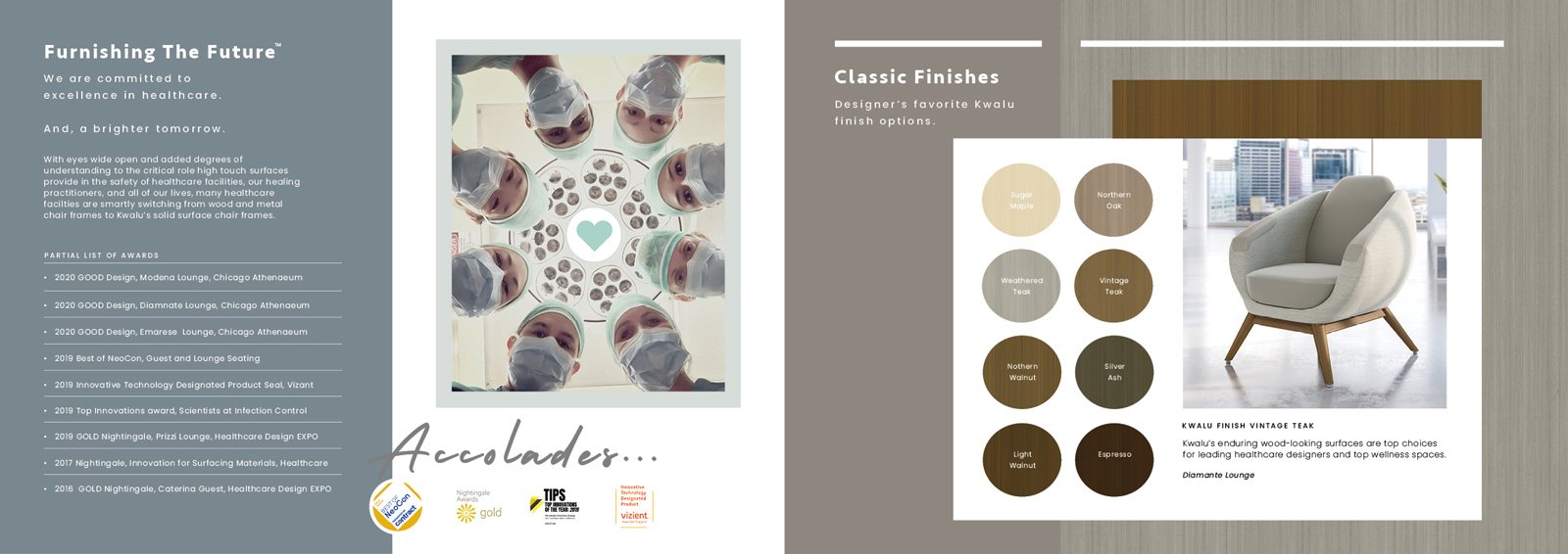
Kwalu moves towards style-forward design + brand appeals. A 12-page “About Us” Brochure. Tara designed graphics and authored all promotional language.
Meganite, Promotional Flyer
Snippet story of The Movement Collection + Pattern Design Attributes
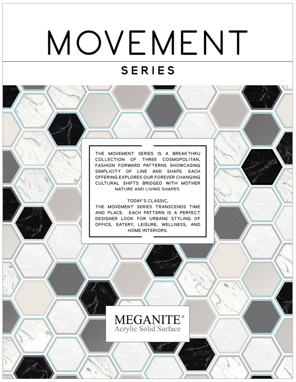
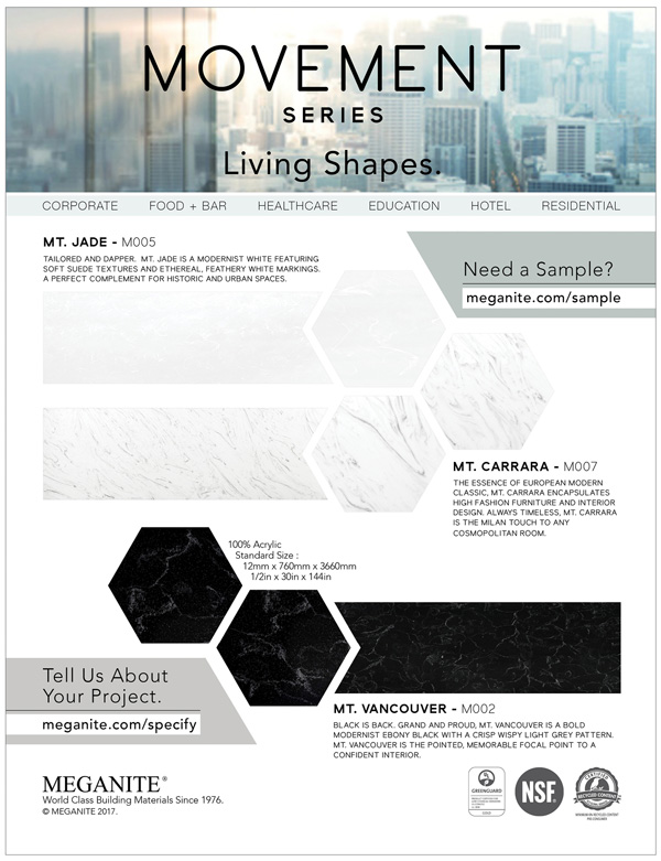
Meganite moves fashion forward. A 2-page international flyer. Tara designed graphics and provided all content messaging
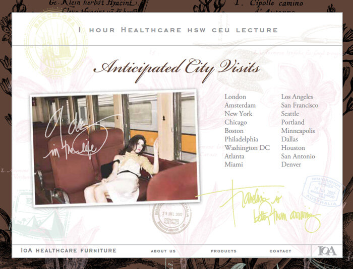
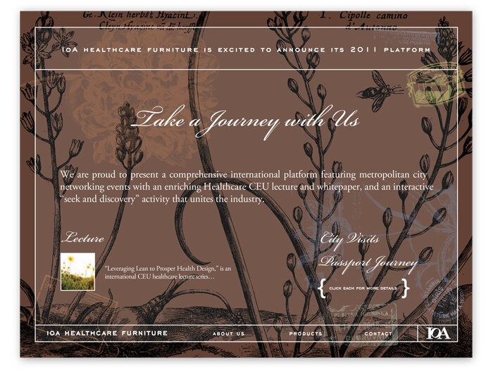
IOA Furniture, Magazine Ad

A Metropolis Magazine Ad announcing IOA Furniture's "Leveraging Lean to Prosper Design" national CEU lecture platform. Tara developed botanical design concept and provided copy.
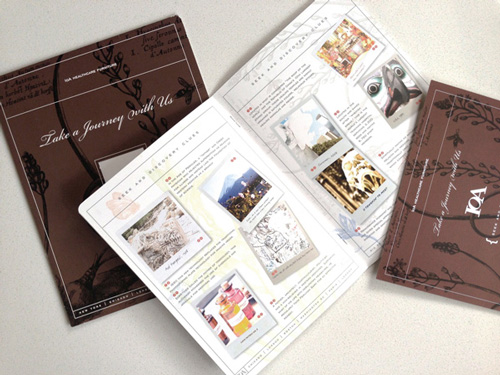
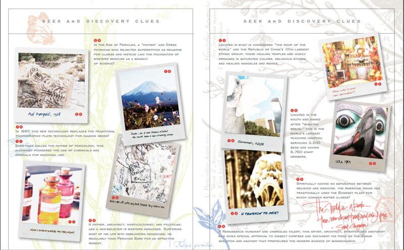
An interactive passport journey for IOA's CEU platform "Take a Journey with Us." Given to lecture attendees, it contained seek + discovery clues and a "pass it forward" mailing feature to promote professional networking and win prizes.
Ms. Hill conceptualized concept, developed travel "game" and mailer format, authored copy, and lead graphics.
IOA, “Take a Journey” Interactive Passport
DuPont Corian, Healing Color Collection “Look Book” Tear Sheet Tool
Tara's "story telling" color language for Dupont's national "Healing Colors" Corian Collection and healthcare campaign. She designed the collection, authored the copy/story, and served as its brand voice and international maven.


Norix Furniture, The Naturals Color Series

Tara's "story telling" color language for Norix’s "The Naturals" Color series of roto-mold colorations positioned for healthcare and corrections. She designed the collection and authored the copy/story.


Hanstone Quartz, Performance Features
Ms. Hill authored the promotional language for HanStone Quartz’s performance features.

Artisan Grey, designed by Ms. Hill
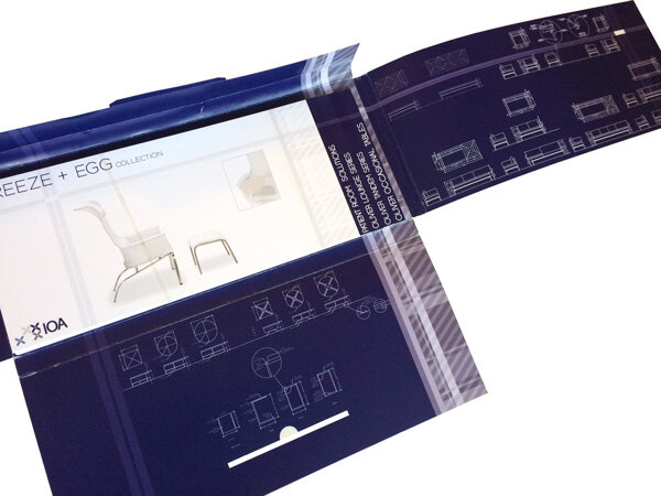
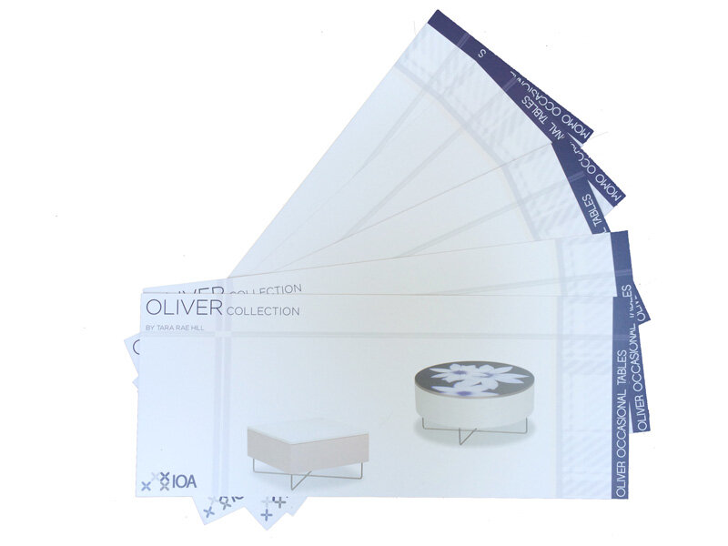
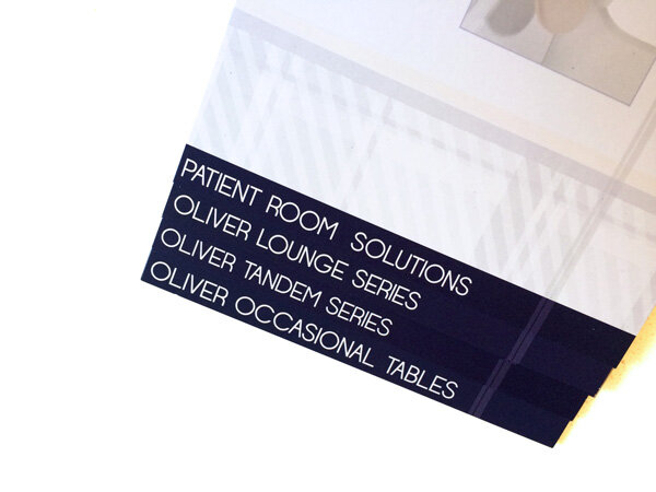
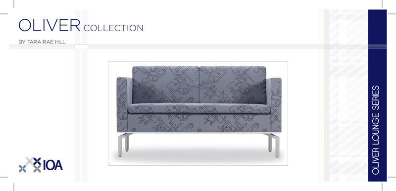
IOA, Horizontal Brochure Cards
Ms. Hill designed “brochure cards,” with full content messaging, that can be collated and placed into a sleeve.
Kwalu, Website Performance Features

Ms. Hill authored promotional language for Kwalu’s performance features.
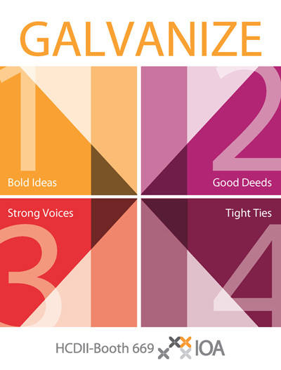
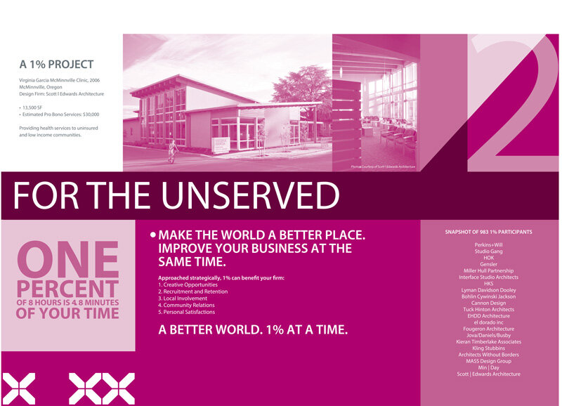
IOA, HCD “Good Deeds Booth” for Public Architecture + AAHID
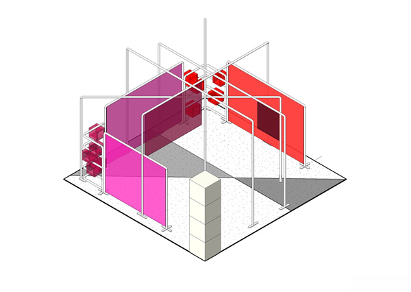
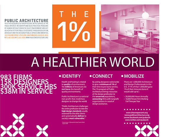
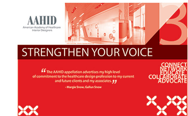
An exhibit encouraging the healthcare industry to team with both Public Architecture ("1% Good Deeds”) + AAHID (“Strong Voices”). Ms. Hill provided full 2D + 3D booth design.
To learn more about Ms. Hill and LittleFISH Think Tank