Fashion

Grounded Earthens

Year 2021, a hopeful new frontier. After weathering a year of uncertainty and unrest, we crave comfort and stability as we also seek joy, adventure, and life's simple indulgences (even if from only our homes and streaming shows!). Color will play a critical role this year with "life + human" unlike seen before -- as palettes will range the gamut from imbued pastels, to energetic brights, grounding earthens, and techno super chromatics.

Today's inspirations take us to our secure and familair natural roots with celebrations of chalky Denims, Terracotta + Red Rusts, Canyon Sands, Warm Taupes, + Cool Herbal Green.

ENJOY Color enthusiasts!
#color #design #interiors #architectural #fashion #trending#littleFISHthinktank

Web_Color-Montage-Boards_Grounded-Earthens.jpg

Vio-la! Arizona Sunset Dreaming

Do you hear it? Cece Peniston's “Finally it’s happened to me… and I just cannot hide it.” As we orbit further into a life of purple-y based cosmos and inner reflection hues, Color Montage "Vio-la! Arizona Sunset Dreaming" explores a medley of violeaciousness in a split complementary partnering of optimistic yellow-orange sherbets. We often over look oranges in palette arrangements due to their high expression. However for year 2020, like many aspects, last year's earthen color forecasts have been interrupted. There is a shift towards more color liveliness and out-of-the-ordinary arrangements (yes!). For ORANGES, especially when yellow leaning, they aide in feelings of vibrance, joy, cheerfulness, positivity -- and bring forth your BEST in creativity. I elected to keep this board with expressive saturated orange sherbets, but for a softer feel, just "value shift" to pastels and muted versions. Presto!

0_Color Montage Boards_Sherbert Lilac Lavender.jpg

Bouquet of Color Delight

A “Bouquet of Color Delight." As we further push into the 4th industrial revolution, blitz advance with new innovations, launch advanced rockets and spacecraft, and also, look inward to personal health and spirituality, Year 2020 has continued a shift towards purple-based hues (warm and cool): marsala, amethyst, lilac, lavender, and periwinkles. As we enjoy these hues, we are expressing them in all values from wispy tints to expressive saturations. To visually balance and modernize, these mystic hues mix well with dusky desert tawnies, muted peaches, french blues, and deep lagoons. Enjoy color enthusiasts!

0_Color Montage Boards_Indigo Marsala Mauve.jpg

Mood Board for Youth Groups

Developing color, materials, spacial design for a leading Higher Education furniture manufacturer’s 3D media deliverables, an explorative palette for today’s fusion student groups. A bouquet mix of colors inspired by Scandanavian mutes and Eastern pop hues, dark shades, and hue-centric street footwear.

Web_Kwalu_Small-Wait_Palette-+-Materials-2.jpg
Web_Kwalu_dorm_hub_large_04.jpg

Opposites Do Attract

Who says opposites do not attract? Enjoy "Opposites Attract: Dramatic Eclecticism" Color Montage Board. This mood board is inspired by a high fusion of divergent color, period styles, geometries + organics, hard + soft surfaces, and high glosses to mattes.

You can be cool and spicy, vintage and modern, high hip and sensually sophisticated all IN ONE;0)

#SherwinWilliams #BehrPaint #color #trending #interiors #tararaehill #LittleFISHthinktank

Color Montage Board_Opposites Attract.jpg

The Raw Naturalist

We continue to appreciate, from egalitarian to luxe products, the genuineness of our earthen world, the love built into hand craft creations, + "touchy-touch" authentic raw materialities. As we head into our 4th industrial revolution (hyper tech), we still romanticize yester-year's "The Naturalists." That is, the artisans, scientists, their sketches, and color documentations of flora + fauna). 
#Naturalists #color #trending #tararaehill #LittleFISHthinktank

Color Montage Board_The Raw Naturalist.jpg

Paprika + Tabascos

Ready to sizzle? As we turn to appreciating Chinoiserie + Cinematic Reds this season also look to heated, earthen, spicy Paprikas + Tabasco's (Cinnamons too). These hues, seated between orange and red, make perfect complements for putty peaches, raw taupes, muted blushes, parchments - and also jewel-tone sapphires, emeralds, and  lively teals. Enjoy! #color # trending #Interiors #tararaehill #LittleFISH #pepper #paprika #tabasco

Color Montage Boards_Paprika + Tabascos.jpg

Modern Herbals

Who is loving on greens right now? With increased wanting's of escapism, soothing environments, romanticisms of yester-year - PLUS simple luxuries and a drive towards more modernity ... Greens are the "it" colors.  Color Montage Board "Modern Herbal" is a celebration of Herbal, Lichen, + Celadon greens.  They make PERFECT color pairing with trending Copper Blushs, Confident Blues, Bold Blacks, + Seductive Lilacs.  

Color Montage Board_Celadons + Eucalyptus Greens.jpg

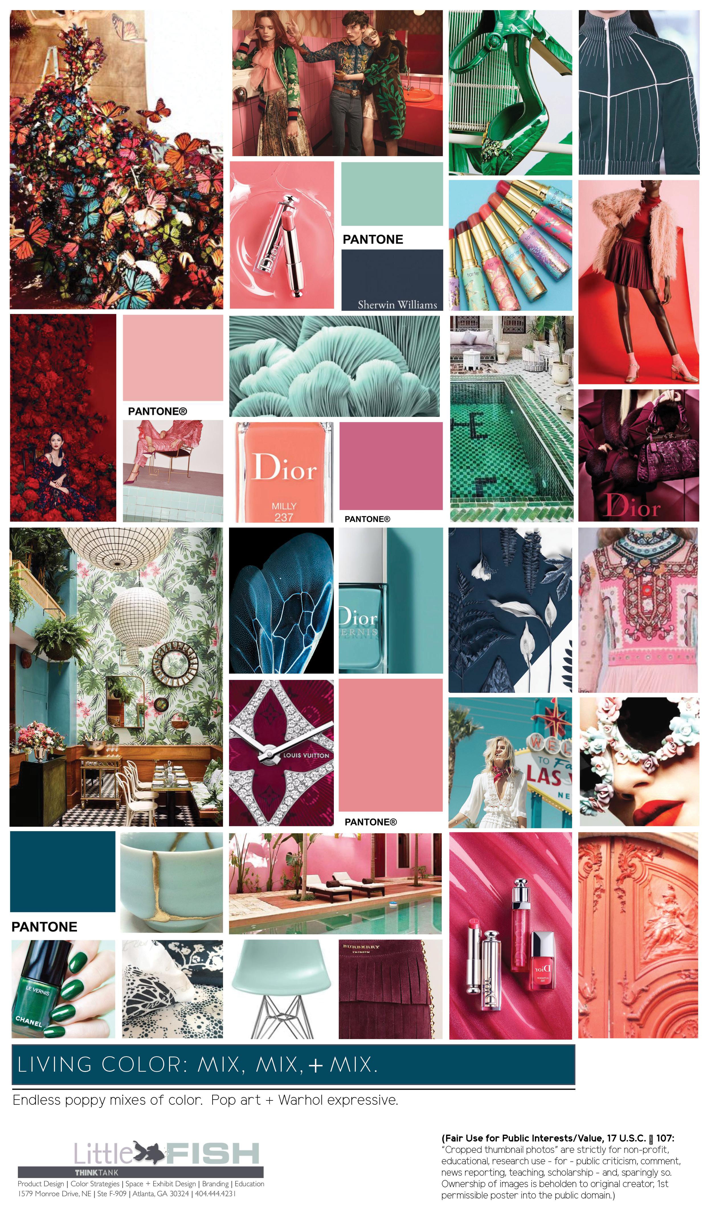
Living Color: Mix it! Mix it!

Inspired by 2017 Paris Fashion Week's "Haute Couture" Runways.  We are living in times with the mixes of color are more then "ever before." Even for commercial interiors that are human centric and/or wellness focused, the genesis of palette preferences are often influenced by our love of fashion and style. These colors are a reflection of our love of wanderlust (literally or virtually), the celebration of the female (and by doing so ironically pushing the boundaries of "what IS gender"), and are reminiscent of romantic vintage days.

Color Montage Board_Color Mixing.jpg

Winter Peaches

If you're a fan of watching apparel and cosmetic trending, which typically are precursors for interiors, you've noticed a lean to "Winter Peaches."  These muted apricot tints are quite versatile and bridge ALL socio-demographics of age, gender, origin, education, and income.  Treat them historic or super modern and mix with minks, bronzes, emeralds, blonde woods, and/or luxe metals.  Just peachiiieeeee!

Color Montage Boards_Winter Peaches.jpg

Cinematic + Chinoiserie Reds

Have no fear - Reds areeee here! Bold, passionate, powerful, imperial, and even tribal... Cinematic + Chinoiserie Reds are the show stoppers of this year's fall fashion runways. All reds are making stealth appearances, but my favorites have been Fendi's, Dior's, + Valentino's. These Reds are sensual, glamorous, bewitching, emboldened - AND SUPERrrrr GORGggg.

Color Montage Board_Chinoiserie Reds.jpg

Earthen Suede-y Taupes

Earthen, elegant, chi-chi, at times raw, and "oh-sooo" cashmere... are the "Suede-y Taupes." At times when many of us want to experience and touch authentic materials and products, hand crafted items and touchy-textures, we ALSO do not want to wholesale our luxuries. The Suede-y Taupes are a perfect color solution to satisfy such cravings. Sherwin Williams launched #PoisedTaupe as their 2017 COY. It is greyed with a French Greige undertone and with a very faint hint of Aubergine. 

Color Montage Boards_Taupe.jpg

Lemons, Canaries, + Bright Golds

As we lift from recession dulls and celebrate life and optimism, the brightest hue on the color wheel is increasing in interest.  Depending on the chroma and value, Lemons, Canaries, + Golds can be quite BRIGHT, high vocal, and emit great energy. Effective in increasing optimism, enthusiasm, and cheerfulness, Yellows are quite versatile in expression.  Their context can one of egalitarianism, "inclusion casual," or downright exclusive luxe.  Tackle bravely and always with a mindfulness of intensity, proportion, and adjacent colors.  But, never fear expressive Yellows! 

Color Montage Board_Yellows.jpg

Luxuriant Lushy Foliage + Emerald Greens

OKkkk, you crazinnn' Green Lovers! Say hello Color Montage Board - "Luxuriant Lushy Foliage + Emerald Greens."  A board to bath ourselves in lushinessssss.   With growing interests in Mother Earth, escapism, transcendence, rejuvenation, and glamorous nostalgia - it is no wonder why these greens are trending.

Since Pantone named Emerald Green their 2013 COY, Emerald greens have salt and peppered fashion and interiors.  In 2016-2017, they gained more traction as they evolved into shades of kelly, kale, asparagus, hunter, forest, and tropic.  Super saturated, expressive, and inherently classic, these leafy + jewel tone greens serve for a fantastic complement to almost every trending color.  They'll behave just as a grounding neutral would.  ENJOY!  

Color Montage Board_Foliage + Emerald Greens.jpg