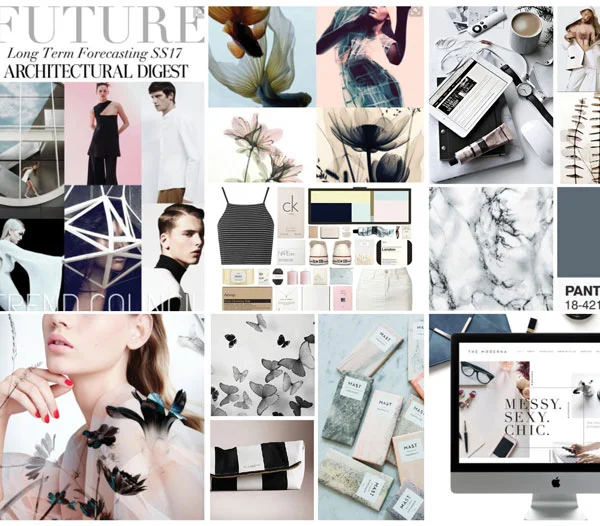
"Wonderland Tints + Tones" are "almost whites." They are super tints of Winter Peaches, Copper Blushes, Frenchy Blues, Atmospheric Lilacs and Simply Whites.. Lovely when partnered, RIGHT? These super soft, cloud-like, chalky pastels are inspired by romanticism, the rise of the "power female," and nostalgia of yesteryear. To quickly modernize this palette mix with Jet Blacks and Optic Whites. ENJOYYYY my friends!
Opposites Do Attract
Who says opposites do not attract? Enjoy "Opposites Attract: Dramatic Eclecticism" Color Montage Board. This mood board is inspired by a high fusion of divergent color, period styles, geometries + organics, hard + soft surfaces, and high glosses to mattes.
You can be cool and spicy, vintage and modern, high hip and sensually sophisticated all IN ONE;0)
#SherwinWilliams #BehrPaint #color #trending #interiors #tararaehill #LittleFISHthinktank
Modern Herbals
Who is loving on greens right now? With increased wanting's of escapism, soothing environments, romanticisms of yester-year - PLUS simple luxuries and a drive towards more modernity ... Greens are the "it" colors. Color Montage Board "Modern Herbal" is a celebration of Herbal, Lichen, + Celadon greens. They make PERFECT color pairing with trending Copper Blushs, Confident Blues, Bold Blacks, + Seductive Lilacs.
Wonderland Tints + Tones
Super tints of Confectionary colors this Color Montage displays interior applications of these misty, atmospheric pastel colors. They feel like a dreamlike watercolor streetscape, eh? These ethereal colors are often chalky and are trending in apparel, cosmetics, food, and European automotive brands.
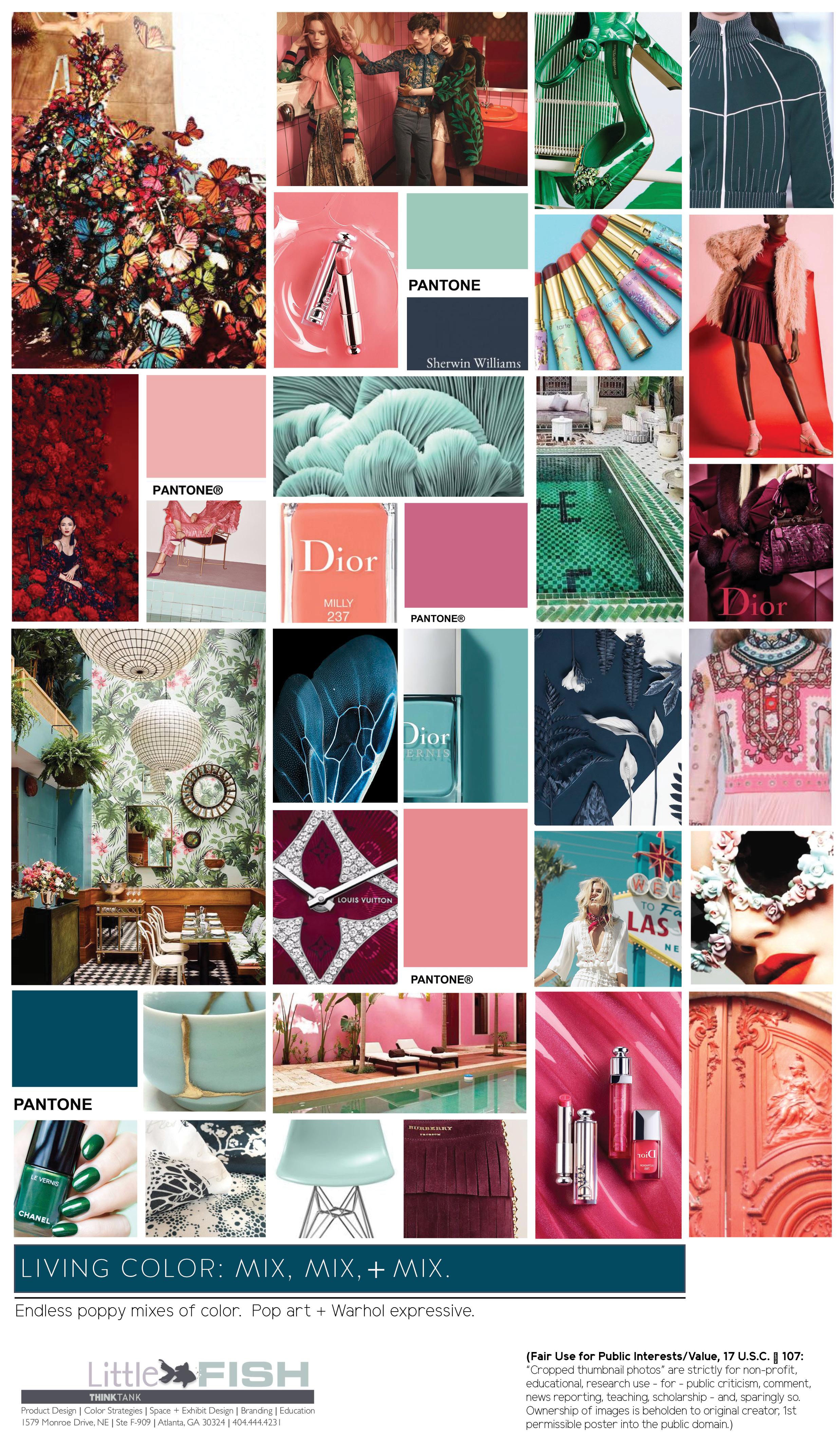
Living Color: Mix it! Mix it!
Inspired by 2017 Paris Fashion Week's "Haute Couture" Runways. We are living in times with the mixes of color are more then "ever before." Even for commercial interiors that are human centric and/or wellness focused, the genesis of palette preferences are often influenced by our love of fashion and style. These colors are a reflection of our love of wanderlust (literally or virtually), the celebration of the female (and by doing so ironically pushing the boundaries of "what IS gender"), and are reminiscent of romantic vintage days.
Wonderland Tints + Shimmers
As many continue to yearn for quieter, less chaotic simpler days, as the rise of the female propels, and we are reconsidering concepts of luxury, many for 2018-2019 will further embrace soft, amorous muted tints. These are slight slips, whispers of color. Often muted, incredibly subtle, and understated. Initially, you may think you are viewing a white, beige, or grey only to be pleasantly surprised it's a color! Depending on their materiality they can feel egalitarian (matte chalky pottery) to full on posh (metallic velvets). These faint Wonderland Tints range from powder and beach glass blues, to putty peaches, taupe blushes, golden beiges, and misty heathers. They partner perfectly with smoked glass and bronze metals.
French Blues + Golds
For 2018, our love of yesteryear continues. 2017 concluded with a turn towards more filigrees, luxe metals, french/denim blues, and styles that feel Byzantine + Renaissance. Which we tend to forget, Renaissance stands for "Renascence"... a revival, into the light, reawakening, and reemergence. From Guo Pei, to Elie Saab, Valentino, and down to DIY Shabby Chic offerings, we yearn for Life, Love, and Vigor. (upholstery fabric: Duralee 42468 56 Blue/Gold).
Winter Peaches
If you're a fan of watching apparel and cosmetic trending, which typically are precursors for interiors, you've noticed a lean to "Winter Peaches." These muted apricot tints are quite versatile and bridge ALL socio-demographics of age, gender, origin, education, and income. Treat them historic or super modern and mix with minks, bronzes, emeralds, blonde woods, and/or luxe metals. Just peachiiieeeee!
Constellation Indigos + Violets
Mo' mo' color. "Constellation Indigos + Violets" on deep purple-y indigos. Thus, more saturated and "twilight bluer" purples then Pantone's Ultra Violet (though I've included bc they make great color partners). With some trending leaning to a wanting of escapism, innovation revolutions, a kiss to the 80's, and a stronger sense of mind/self -- these Constellation Indigos + Violets are wonderful.
Juicy Olives + Military Greens
Confectionaries with Jet Blacks + Optic Whites
Balmain's + Versace's 2018 runway collections displayed Confectionaries, candyland colors, Optic Whites, Jet Blacks, and faded denims. Already trending in apparel and home, this palette is making its way to contract interiors. Often slightly misted, but still represented.
Cinematic + Chinoiserie Reds
Have no fear - Reds areeee here! Bold, passionate, powerful, imperial, and even tribal... Cinematic + Chinoiserie Reds are the show stoppers of this year's fall fashion runways. All reds are making stealth appearances, but my favorites have been Fendi's, Dior's, + Valentino's. These Reds are sensual, glamorous, bewitching, emboldened - AND SUPERrrrr GORGggg.
Urban Chicy French Blues
Urban Chicy Blues which evoke both French Empirical and American Colonial days. Push over green-based minty and seafoam blues! Denim blues reappear. They are modern, vogue, atmospheric and can also fall quite feminine and vintage.
Earthen Suede-y Taupes
Earthen, elegant, chi-chi, at times raw, and "oh-sooo" cashmere... are the "Suede-y Taupes." At times when many of us want to experience and touch authentic materials and products, hand crafted items and touchy-textures, we ALSO do not want to wholesale our luxuries. The Suede-y Taupes are a perfect color solution to satisfy such cravings. Sherwin Williams launched #PoisedTaupe as their 2017 COY. It is greyed with a French Greige undertone and with a very faint hint of Aubergine.
Atmospheric Aubergines + Lavenders
Alrighty Colour Gurus + enthusiasts... with misty fall and winter creeping in, many are seduced by Atmospheric Aubergines + Lavenders as we enjoy our inner city wanderlust experiences.
Simply Chic Whites
Both Benjamin Moore + Sherwin Williams showcased Soft Whites as their 2016 COY. Why? As many of us search for simpler days and look to authenticity (including our materiality), we appreciate the simplicity White provides. Benjamin Moore's "Simply White" is one of my all time favorites. My studio is illuminated with it. Also look to Sherwin Williams' "Pure White." Interested in an Optic White (purest modernist white?). Benjamin Moore's "Super White" is a perfect lean to.
Rose Quartz
First posted on Linkedin early this year and receiving 2600 views, these Pink Blushes + Rose Quartz continue to trend. Soft, modern, and not just for girlz.... mix with lux metals. Enjoy!
Confident Blues
How about some feel good Confident Blues? Blues continue to trend hard and this includes Deep Denims, Indigos, Lagoons, + Midnight Blues. They are timeless, ageless, self assured, and elegant. Whether you choose to mix with Optic White, Jet Black, Blush, Lemon, or Bright Pops... these Confident Blues will give a strong foundation to any palette.
Lemons, Canaries, + Bright Golds
As we lift from recession dulls and celebrate life and optimism, the brightest hue on the color wheel is increasing in interest. Depending on the chroma and value, Lemons, Canaries, + Golds can be quite BRIGHT, high vocal, and emit great energy. Effective in increasing optimism, enthusiasm, and cheerfulness, Yellows are quite versatile in expression. Their context can one of egalitarianism, "inclusion casual," or downright exclusive luxe. Tackle bravely and always with a mindfulness of intensity, proportion, and adjacent colors. But, never fear expressive Yellows!
Urban Chics
A grouping of Denims, Heathers, Misty Purples, Blushes, and Greiges inspired by hazey wanderlust metropolitan travels.


